Our Brains Eden team was made up of;
- Stina Sheehy; GUI Designer and Graphic Artist
http://stinasheehy.carbonmade.com/
- Robin Silcock; Producer (of sorts), 3D Modeler and Texture Artist
http://www.robinsilcock.com
- Jess Magnus; 3D Modeler and Sound
http://jmagnusportfolio.blogspot.co.uk/
- Steven Taarland; Unity Coder, Scene Coder and Game Designer
http://staarlandgames.co.uk/home/
- Martin Scott; Unity Coder, GUI Coder and Designer
 |
| Game Icon |
Below are some screens which Stina made for the game (the logo above is also her work);
To explain the game a little further, here are some 'help screens' we put into the game - so that when a player was playing the game, pop-up instructions wouldn't hinder gameplay.
The game is meant to speed up (as in more mountains, and a faster moving bloon) over time, but the code never quite worked properly. I have a feeling that it took too long for it to speed up so that it was so gradual it was hard to notice. Similarly, the lever meant to accelerate the bloon was too subtle.
In the demo we submitted the mountain goats didn't in fact reduce your health, it was only by hitting the mountains themselves that you lost health. Though by having your vision blocked by the goats, you were more likely to hit the mountains so unintentionally, they did cause a loss in health!
The last UI glitch (shall we call it) was that between plays of the game, the counter for the number of people saved did not re-set. I explained this on the day as representing the overall and combined effort of players at the Jam to save the stranded people.
We had originally wanted this black screen to appear when you pressed play, but we sadly ran out of time. It would have served as a little re-cap of what the UI meant to the players.

If we had had time (a term I am bound to use a lot more in this blog post) we wanted the first play through of the game to feature in-game instructions. Much like that seen in Bee Leader (examples below - screenshots from my own iPad)
And now some shots of the modeled 'hanging signs' we planned to have swing down onto screen, or appear hung from some clouds (also shown below) to give the player guidance in-game.
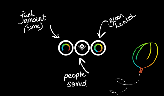
We also included this 'Concept' screen which explains a little of our thinking behind the design of the game;
And now onto some screenshots!
The starting screen has a floating green balloon (bloon) on the screen, and the play button sways to encourage the player to click it.
A typical view in game - here you can see the balloon 'cock-pit' the UI symbols in the top left and the trusty handle for using your fuel and speeding up your journey. The yellow parachute on display is holding fuel.
Here you can see near the gas bottle a goat with a parachute (a little amount of imagination needed). If you hit a mountain goat, it will enter your bloon basket and you have to proceed to shake the phone/tablet to get him out!
Here's a shot of the invasive mountain goat! And then some general shots of the game;
Below is a screenshot of our Drop-box for the weekend, alongside my Texture Artist responsibilities, I also took it upon myself to try and keep things orderly in the drop box. For example, most of these folders also contain an Iterations folder which contains all the old versions and revisions of files - the current and used files being in the parent folder such as 'Clouds'. I learnt a lot about making sure things were named in the correct format (and probably annoyed my fellow artists about not using spaces, capital letters at the start of file names etc.)
Here are the textures I created (at speed and under a fair amount of pressure) for the models in game. (Modeling mainly taken on by Jess, though we occasionally swapped roles in the weekend for some variety)
When texturing, I got some advice from the professionals which were walking round the labs over the 2 days, and they said for ease of use, re-sizing and communication between the artists and coders we should have one texture map per object. Because of this, there are a couple of maps which are shamelessly in-efficient - so please don't judge us on this, as it was a simply 'we have no time!!!!' kind of decision. We do understand how horrible these look in efficiency-terms.
I enjoyed drawing this texture the most as my 2D style is not often this free or 'hand-drawn' - I worked hard to give it a menacing appearance, as you want players to be startled by its appearance on the screen.
I wanted to include a little nod towards Cambridge in our game so the VIP you save in-game (thus scoring 3 points, instead of 1) is Crick, one of the founding fathers of DNA.


No comments:
Post a Comment